New Icon?
Drew-Chase opened this issue · 21 comments

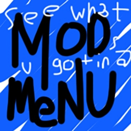
While I appreciate the intention behind the new icon, its visual style appears less polished than the previous one. The old icon had a professional quality that I feel is missing in the new design, which looks a bit like it was created with basic tools. Would it be possible to revert to the previous icon, or explore designs with a more refined aesthetic?

From what I see it got changed in fbcd1c7 but I am curious why.

From what I see it got changed in fbcd1c7 but I am curious why.
i dont know but i think its stupid

That icon is obviously a joke and it's their choice to let the icon be there.
i do understand that but my question is.. why? it looks so ugly and out of place compared to other mod icons
@Lncvrt yea, it will definitely also turn away potential users.
That icon is obviously a joke and it's their choice to let the icon be there.
i do understand that but my question is.. why? it looks so ugly and out of place compared to other mod icons
It’s not about why, it’s about why not?
@Lncvrt yea, it will definitely also turn away potential users.
Mod Menu is like the standard Fabric mod that everyone has it right now so why would they care? Every Fabric modpack you play has Mod Menu installed nowadays.
and thats my point
why ruin the branding of the icon when it was perfectly fine before?
the icon is basically ruined because of whatever joke idea they had
That icon is obviously a joke and it's their choice to let the icon be there.
i do understand that but my question is.. why? it looks so ugly and out of place compared to other mod icons
It’s not about why, it’s about why not?
@Lncvrt yea, it will definitely also turn away potential users.
Mod Menu is like the standard Fabric mod that everyone has it right now so why would they care? Every Fabric modpack you play has Mod Menu installed nowadays.
I disagree, most people make their own modpacks/instances. When I update all my mods and saw the new icon, I was confused about what mod it was, and was gonna uninstall it, until I realized it was this mod.

ModMenu is Prospector's mod, so ultimately this decision is up to Prospector. Here is the response when I asked most recently:
Prospector: it's not a joke, that's the official mod menu icon
So the only suggestion I can offer those of you who are greatly offended by the new icon is, make a new mod menu better than this one and maybe you can become the mod menu maven of Fabric.
if any of us were to do that, we would probably just fork the repo and undo the commit
out of all the mods in the screenshot below, what one looks the most out of place to you?

out of all the mods in the screenshot below, what one looks the most out of place to you?
im actually going to ask my friend that right now
out of all the mods in the screenshot below, what one looks the most out of place to you?
im actually going to ask my friend that right now

if any of us were to do that, we would probably just fork the repo and undo the commit
The license is MIT; you are free to do this. That's how FOSS works. I suggest making a new icon rather than going back to the old one. You'll have to find a new name since the CF and MR both already have ModMenu registered. But the real commitment you'd be making is maintaining a mod requiring heavy maintenance to account for Mojang's constant changes. That's also how FOSS works.
out of all the mods in the screenshot below, what one looks the most out of place to you?
Do you think Prospector is not aware of your arguments here? And don't try to convince me; it's not my mod, I'm just trying to help answer the question what is going on with the mod's icon. The new icon is officially the icon of ModMenu according to the project owner.
Please stop flooding this ticket with pointless images of chats and whining about something neither you nor I can change. Or I'll lock the comments...
go ahead and lock it
i wouldnt be releasing it on modrinth as its pointless to but i consider the new icon very stupid.
creating a fork and just clicking the sync button isn't difficult and ive done it in the past
sigh Some people.
Cloning the actual answer to this question here:
ModMenu is Prospector's mod, so ultimately this decision is up to Prospector. Here is the response when I asked most recently:
Prospector: it's not a joke, that's the official mod menu icon
So the only suggestion I can offer those of you who are greatly offended by the new icon is, make a new mod menu better than this one and maybe you can become the mod menu maven of Fabric.