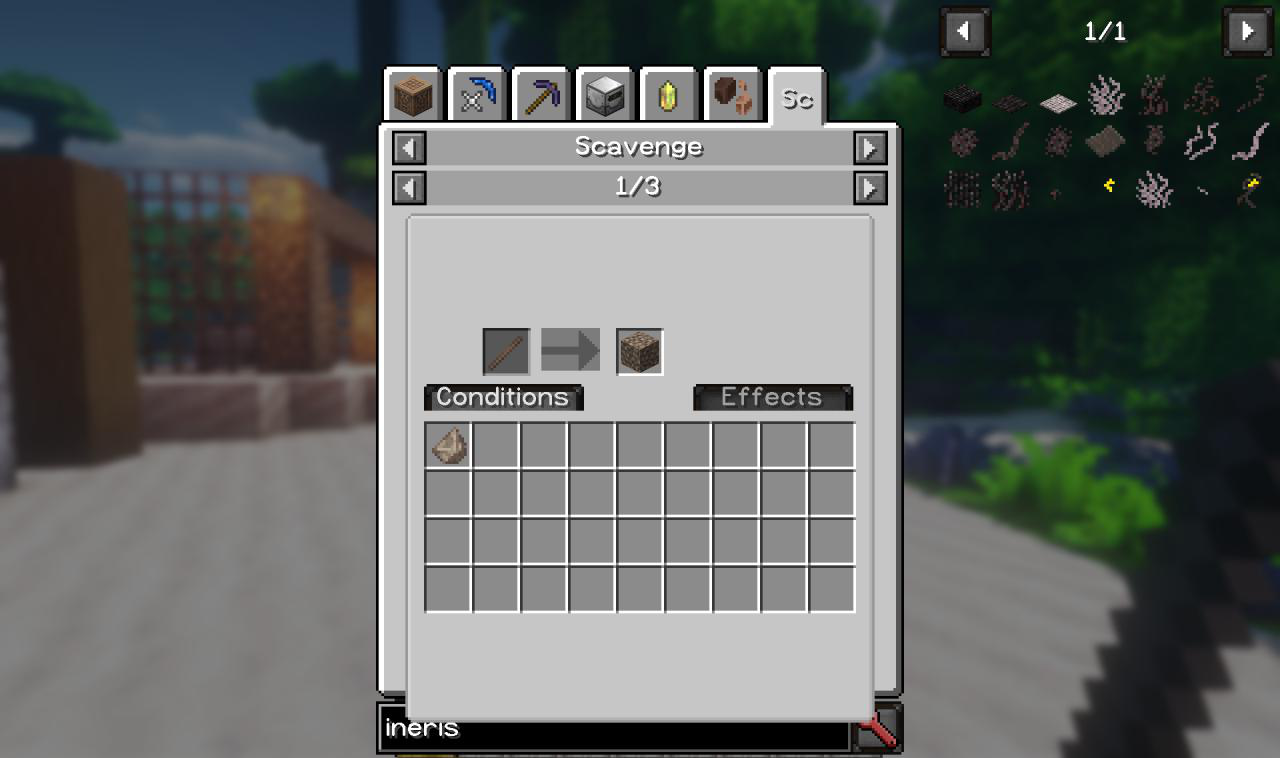
JEI GUI
TimGoll opened this issue · 3 comments
@TimGoll how do you define "most important" information? Because these informations can be provided by the scripter itself. So i can't say "Conditions" are not important because all of them are.
The gui resize yeah thats a issue.
I get your point. At least for me, the most important information are: tool, input, output. The same like yours. But I don't get why the arrow has a dark grey background when all effects are hidden.
I update my issue:
- An icon would be cool
- fix the size
- move the two buttons to the right and make the square, hide them instead of greying them out
- remove the dark shadows on the arrow and the input square
Yeah then disable the inputs and the buttons gray out and they know all the visible stuff is what they need.
about the things:
- Icon: Yeah sadly i am not an artist and i kinda want to prevent that the eyes of people start to bleed. (I am that bad at art)
- Fix the size: Yeah i am aware and its obviouse.
- Yeah as icon buttons are so easy to implement well and also deliver easily the "What they mean" information. Its text for a reason, also artist thing.
- You know i have eyes too.
Anything else?
