[Request] Flattened GUIs
Lolcroc opened this issue · 6 comments

Feature description
Tetra GUIs reflect the modular nature of tools and materials, but this leads to GUIs where I find myself performing lots of clicks on nested menus and descriptions. Given that Tetra GUIs only take up a fraction of the screen, this feature request is to flatten some parts of the GUI "tree" and display the elements directly. Examples are:
- Crafting upgrades in the Tetra workbench. There are many levels in this GUI even though the icons are very small.
- Material properties in the holosphere. Instead of having to hover over every single icon and remember its value, show a table of material - properties rows instead
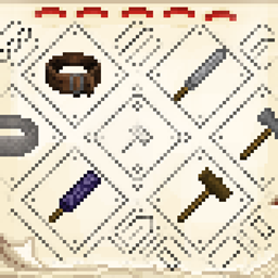
For an example of the first suggestion, here is a somewhat flattened GUI

In the top left, you put the item with integrity and honing progress displayed below as usual.
In the top right, we have tool properties
In the bottom left, a list of components
In the bottom right, all upgrades for every component displayed in the bottom left.
Component upgrade descriptions are displayed as a tooltip. There is a single material slot that you can leave stuff in while browsing upgrades. This also means you can do fancy things like display tool properties delta while hovering over upgrades with an item locked in the material slot.
Obviously the right-left symmetry of the Tetra GUI is sacrificed, but all in all I believe a template such as this one will save many hours in GUIs whilst staying true to the original Tetra experience.
How it improves the player experience
Spend less time in GUIs, spend more time playing the game.
Tetra synergies
N/A


Yes, I also found such a problem. Once there are a lot of materials, the GUI display will be very ugly, because only one line makes the GUI look very ugly and the materials difficult to find. If only the materials can be changed from one line to multiple lines, I can take time to play. My game version is 1.16.5.

So if I get you correctly the problem you're trying to present is that too many clicks are required craft a new module?
And your suggested solution is to merge the schematic list with the schematic details view as to reduce the required amount of clicks by 1 click (from 7, or from 5 if you use shift-click to move items), and you expect this cut down several hours of having to click through GUIs over some unspoken amount of playtime? At the same time you suggest all other elements in the UI to be moved around arbitrarily as to better utilize some supposed available space on the screen?
The example is an example. The main point of this request is that I find myself spending a lot of time in Tetra GUIs, due to the way that elements are organized. It is not merely about saving a single click. For example, if I want to compare two upgrades with a given material, I have to:
A) Select the first upgrade through a series of clicks
B) Hover or put in my material, and remember the values
C) Go back and select the second upgrade, again with two clicks
D) Hover over or put in the same material, and compare the same values
The time spent doing this process obviously increases for multiple materials, and for multiple upgrades. It is because you have to traverse multiple levels in the GUI back and forth for a single task. In the example I gave, this process of comparing materials and/or upgrades is collapsed to a single level. This is the main point I was trying to make.
The same is true for comparing material strengths in the holosphere. The comment by @Annijang is an excellent example of where using this GUI is clunky for the task it was meant to do - comparing material properties.
So it's about comparing stats for multiple modules at the same time? That's more useful, rewrite your issue to focus on that and drop your example that's an example. But I do want examples on when you'd actually want to do comparisons like that. I'd also suggest you don't draw inspiration from the supposedly excellent comment and call things ugly, that's not going anywhere.
Your comments surprise me, in a negative way. I never said your mod is ugly. I think it’s quite nice, but you’re acting like a dick about it. Closing this issue for mod makers that can take feedback