Once again asking for better UI configurability
IdrisQe opened this issue · 2 comments

Feature description
Stylistically, the UI is fantastic. Functionality-wise it's, unfortunately, hard to navigate and physically strains my eyes.
Several people have asked for things like this already only to be brushed off with "you can change UI Scale in Vanilla" but the actual difference between Tetra UI at say, Scale 2, vs. Minecraft UI at Scale 2 is ridiculous. If I make my Minecraft UI bigger it looks like a game from 2004 at 640x480 resolution, but the Tetra UI is tiny at the current scale so I can't handle that either.
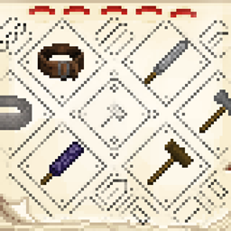
This mod NEEDS settings for icon scale/text scale/or mod specific UI scale in general- Material icons or Part Selection icons in the workbench/holosphere are ridiculously tiny on a 1920x1080 screen at 2 UI scale, while Minecraft's UI is visibly perfect sized for a monitor this big at this scale, and several pieces of text in Tetra UIs are way smaller than Minecraft text at the same UI scale. If the Minecraft UI scale is changed itself, the Tetra UI may become a nice size but everything else becomes too big. This is obviously not ideal.
It would be great to have the ability to customize certain other aspects of it, namely the horrible-to-navigate Materials UI:
-Configure how many rows show in the Material UI (I have the screen space, why am I stuck with 2 rows and awkward horizontal scrolling when I could just have more rows?) there was another suggestion for this but it seemed to be ignored in favour of pointing out the scrolling again.
-Some sort of buttons to sort materials in the UI based on certain traits since currently going through each material and looking at the half-dozen stats each has it's REALLY hard to plan out what material to use because they seem to be in absolutely no particular order and there's no way to manually or automatically sort them.
Or, barring configurability, a rework of the UI so at least things are scaled relatively the same as things in the main Minecraft UI at the same scale settings, to avoid the issue of inconsistent UI scale entirely.
How it improves the player experience
This should be fairly obvious, since the entire thing is about the user interface. A better interface = better experience using said interface, by the player.
Tetra synergies
I assume one of the goals of Tetra is to feel nice to use, and to be fun and not frustrating... and not give eye strain or force a catch-22 situation by making every other UI too big to make the Tetra UI usable.
