Icon enhancement
Unoriginal02 opened this issue · 89 comments

Hello, i don't know if it is here where to put this, but i would suggest an enhancement of the icons as some of them went funny with their shadows.
I've prepared some of them to test them with the plugin, and i'd love to share them with you if you like to.
Also if you need something special for those icons, just ask.
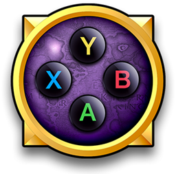
I add a sample of them.


These look pretty cool 👍
I'll try using them for some things in game and get back to you 😄
I like the general style of these buttons, but mostly I enjoy the inner parts.
The subtle stroke, the colors and the hint of grain is very pleasing.
However, I think a better approach for the large buttons would be to skip the round backdrop altogether and use either a stroke, a drop shadow or a bevel of some kind to distinguish it from the background.
I tried to apply these to the binding interface, but while it looked stylish, it didn't quite fit the sleek look and feel to the rest of the surrounding graphics.
I know we once discussed the look of the Diablo 3 icons:

What if you could take your style and create a set like this?


Note there is a shine on the outer ring that may not be apreciated due tio the white background of this page.
Try it on a dark background.
These look fantastic. Thank you so much.
Don't worry about formatting and all that, I'll handle it.
Will be a while before they show up in-game, but I'm definitely going to use them.
Merry Christmas! 🎅
I don't think you need to actually, unless you think they can be improved.
If you're going to do it anyway, 16x16 is enough. 😄
Oh, i asked because in another issue we were talking bout creating two sets, one for the small icons of the action bar (a little more pixel crisp), and a high definition ones
And now, everyone is sleeping and pretty quiet here, so i can take this to my advantage
Please, tell me the estimated size of the small icons. gonna try to make them really quick.
Nvm, self-answered

In case you like this, the only problem i think i have is with the stick buttons, (LSB and RSB), but if im not wrong, those buttons are not used in the action bars.
Correct me if im not wrong. In the action bars you can only use, buttons, directional buttons, and bumpers. am i rite?
Hello.
If you like them i send you both.
I did not exported the files, as i don't have much time spare :S
Hope you dont mind
edit:
I reuploaded the file, as some letters were weirdly aligned.
Also i added an optional color glow for more SWAG.
I tried to label everything so you can work with it.
Merry christmas, and i hope you like it!
BUTTONS_64_PX_GLOW.zip
Hello!
It is no specific font. i did all in shapes.
Note that due to the small size, there is no much room to place pixels, so it is normal to find similarities.
Here i paste you the entire colection. Hope you like it! i love it.


Two questions:
- Is it possible to add a checkbox somwhere to allow the user place those small icons at the center of the icon? Dunno if it may be interesting. I tried really quick, and it doesn't look bad at all.
- now the sprites are 16x16px. Could they be a little bigger (the canvas), so we can add a subtle shadow under each mini icon so they will be more notorious than now?
Edit: For some weird reason i cannot link a zip file now in windows. Later will try to link the PSD from the mac.
That's actually really cool looking! No they can currently not be used, so you need not worry about it. 😃
What font is that btw? Looks a little too much like FFXIV imo, but other than that I like it.
So I tried rendering all the icons, but I think the 2px stroke was too thick. I reduced the "outer glow" to 1 px and it ended up looking a lot cleaner.

See how much cleaner it looks on the bottom row?
1st row: 2px stroke
2nd row: 1px stroke
Yup. I like it.
I did two pixels fearing it would get noticed, but i love one px
Edit: the reason i used outer glow instead of just strokr, is because i have more control ow what a "1px stroke" is.
This way you can modify the antialiased pixels. Its subtle but there is a big diference than a raw stroke
Edit 2: want me to modify the icons, or you will deal with that.
Already modified them, now I'm just trying to figure out the best way to place them. I think I might have screwed up Triangle and modifiers because I resized them instead of editing the shapes.

Oh, i see, you are looking for a different way to display the combos.
At first i did not notice the top row ("L2 + square").
I only noticed the square
Edit: it will be a good challenge to shrink the size of the icons and keep it pixel perfect btw.
What about making two rows for thos pe combos with three buttons?
Top row: 2 icons max
Second row: 1 icon.
Btw, there must be a better way
Actually not that much of a challenge. I could make super small modifiers and maybe if you bottom-align modifiers and icons it will look okay.
Edit:
Thinking about it, i see that the two button combs are not a problem, they display very well using the same icon size.
The only problem occurs with the three button combos. In wich case you could use smaller modifiers.
By resize, I meant that I squished the actual textures to make them look less rectangular. Compare triangle/R1/R2 from previous screenshots with the latest one.
What do you think a good solution would be? I think the current modifier look is the best so far, but it could probably be improved.


- Yes, that's very easy to achieve.
- You can make them 32x32 if you want to (the size always has to be 2^n). It shouldn't be a problem, but remember that by increasing the size, there's a larger chance that the interface engine cuts off or ignores important pixels, which can make textures look a little off. Here's an example of the Square, which looks rectangular due to reducing the size from 64px to 14px.

These textures look really cool, but I will hold off with implementing them for now until you are completely satisfied with the result.
Ok, no worry. I wanted to do this, as i finally found time to. Is up to you when implement it. :)
Im having a bit of trouble understanding the power of two.
It means that files must be 16, 32 or 64 px?
I owuld only need to add few pixels, like 24x24, just to add a subtle shadow keeping the original size of the icon. If this is not possible, then i would leave them like they are now. Cause i think they are visible enough.
What you think?
Nice of you to take the time. 😃
Power of two means 2, 4, 8, 16, 32, 64, 128, 256, 512, 1024. Basically take 2 and multiply it with 2 over and over again. 24x24 would not work since it's not a power of two.
Maybe you could do just one in 32x32 with the effects you have in mind, for me to test with in-game? Make it a PNG file with transparent background in that case. 👍
Ok, one last question. In the case when you will put a combo "L1+X". Can you slightly overlap the two? Or they must be placed one after the other, creating a tremendous big gap between them?
Note that now the icons are 16x16 and i will add like 4px more to each side with shadow and leave the rest in transparent.
There are easily twelve pixels that could be overlaped, but dunno if it is possible
I can overlap textures, yes, but I think it's better if you stretch the textures instead of leaving a bunch of empty lines on them.

These looks so hot!!
i'm adding the mini icons with and without shadows

Mini icons.zip

I kinda like the top right alignment tbh. Let me add a modifier and see how it looks.
Top alignement - Classic
Center Alignement - kind of a new texture for the icons of the spells we see for 11 years now.
Top right - Expected place.
I like them all.
Do you agree?
Yes. Look at this:

Or vertically aligned just for demonstration purposes:

Varied sizes:

Oh, the counters of the roll spell are unreadable with the combo centered. So sad
Yes. The count can be moved, but I think the right corner is the best position to avoid any confusion.
Regarding the large icons, I had to remove the shine because it looked strange in-game.

No, there was a "SHINE" layer in the button group that I completely omitted because the white border created a strange effect in game when the texture was drawn smaller than 64x64.
Here's another change:

Ah, oh, I see
Love the new pointer. love it so much.
I also remember once we spoke about the weird event that happens when the game cursor and consoleport cursor appear, that seemed strange to have two equal cursors at the same time.
I feel now this is solved.
Side thought. ¿How those it looks if you dont make the cursor "zoom-in" on each action?
i like the glow to "zoom-in", but i find it a bit intrusive if the cursor behaves like this too.
I haven't tried that yet. The highlight is actually parented to the cursor, and it's only the cursor that's animating. The highlight animation is a bonus. 😛
I can try to change it up and see how it looks.
Edit: What do you think?


Check out this effect 😃

This GIF really doesn't do it justice. It looks absolutely amazing in game 👍
Edit: Stiff means it doesn't look vibrant or interactive. Snappy means it feels quick and efficient.
What the fuck!. How did you just do that??
I need to know it!
How this effect behave?
I guess it happens once, the first moment the cursor summons on each new panel (window) and helps the user find the cursor, and then the cursor moves around without zooming, each time you press the button.
Regarding to cursor zooming, what made me ask you about this, is because i feel it is constantly try to call your attention. And by doing that i guess you achieve the opposite effect, the user would skip the animation itself, as the brain always tries to skip what is "known"
If the zooming/summoning happens few times, it will surprise the user and quickly spot the cursor.
Edit: as always, that is just a guessing, based on nothing specific so i may be wrong. I try to share my thoughts in case they make sense to you
It only happens as the "attention grabber". The animation is different when the user presses a button to move the cursor and when the cursor was moved without the user's consent.
The effect is actually an in-game 3D model with a low opacity and custom lighting. I stole the code from the old project (where we messed with lighting and models) and added a really cool looking orb model.
I understand your concern about the scale animation. I don't want to remove it completely, but perhaps reducing it significantly could spare the eyes a bit. I feel like the cursor looks really "dead" and boring without any animations.
Maybe that is the key. Making the zoom less obvious.
Another option is to leave it like this.


Maybe is too much customization, but you could use those two sets to allow the user display:
- Only mini icons
- Big icons with small modifiers
- Big icons
And by default without troubling people too much, maybe just use mini icons.
No, that was removed quite long ago. 👎
I noticed that the animation on the cursor is skewed when using a higher UI scale. Will try to fix that.
I've released all the graphical changes now and they are available for testing in version 0.10.2.

If you find the time, it would be nice if you can make RG, LG and forward/back buttons using the 64 px icon style. I'm going to add the "grip buttons" on the Steam controller and also add the correct textures for the option buttons instead of the copies from Xbox one.
I'd do it myself but I'm not nearly as good as you with vectors 😎
These icons do look better than the ones I currently have. Thanks for contributing :)
If you want me to include these, I need them in .tga format with the following settings:

Each image needs an alpha channel which will remove the opacity of the background:

They should preferably be 64x64 in size. I'd also like to point out these icons may look very tiny on actionbars, which is why it would be great if you could size up the inner parts a bit. I'll try them out asap. Thanks :)
Thank you very much! Love to contribute.
Could you advice me how can i send you the files?
About the size thing, i've seen that where the icons appear with that cool UI border, the inner elements nearly touch that border. it's not bad but i though it might be cool to make the elements not touch and let everything breathe
But by the other hand you are right, This thought compromises the effectiveness in smaller sizes, so i prepared another set of icons way much bigger than the ones you've seen. Then you can check which ones you like.
Question: there could be another set of tinier icons for the action bars? just asking.
Thank you!
It's a very simple thing to separate the icon sets so if you feel like doing tinier icons, sure. The important thing is that they are clearly visible on the action bars. I've added you as a collaborator, you can push the files on the git in a separate folder and I'll incorporate them and see how they fit.
icons pushed, if you need any change, ask it.
hmmm... what about an icon set for each controller available?
Pretty much only DualShock uses a separate icon set. The rest could be covered by doing an Xbox icon set.
Regarding the icons:
They work very well for the large and small indicators, but not for the actionbars. I especially like the arrows. What kinda stands out though is the contrast. It's a little bit too saturated and dark. When resized to smaller versions, it becomes alot more sharp than the washed out old buttons. Could you try tweaking the contrast so that the colors blend better?
Edit: Try making the background color identical to the standard Blizzard frames. Use the map or bag frame as reference.
Example of a mixed version (although I might add your arrows to the tiny set):


Ok, i'll try this new background color.
What about the AOXO icon sizes? I find them readable.
The triangle is especially problematic.
This is an example of a few of the buttons sized up:

Here's the scaling issue on a 1920x1080 (1080p) screen.
With highest UI scale they look great:

With normal UI scale the problem becomes very tangible:

The new buttons look great. Thanks! Feel free to add more stuff if you want to!
Thank you! ¿What do you mean by adding more stuff? Note that this is my first time in github.
What i think is if you accept the icons like the last i sent you, once i gather a bit of time i will do the specivic ABYX set for the other controllers if you want.
Also i'd like to ask you if I can post an introductory post in blizzard forums in order to help spread this awesome tool.
PS: Actually there are two folders of icons, this is also what people get when they download'em?
I mean you can add iconsets or graphics as you please and I'll have a look at it.
I will post on forums about it soon. It still isn't even near completion and wouldn't want to pitch it before having fixed some of the major issues.
I removed the extra folder and simply kept your iconset. The old set is gone now.
If you're actively using the addon and want to give feedback on how it works, add Munk#2333 on Bnet.
How old i feel. I'll look for that bnet thingie too :D
Thank you for introducing me to new tools


Have you tried them in-game? I'm leaning towards the Xbox One set because they are likely to blend better on actionbars, since abilities may match the background colors of the Xbox 360 set.
Later I will export de Xbox one set and push it so you can test it aswell.
I like the Xbox ne set, as in small size we may not see the letter, only the color.
Just uploaded the icons, for fast review i used the same names of the PS ones. i think they look hot. what do you think?
PS: Excuse me if i don't write my commitment titles the way they should,

They look great, even with my resolution. Thanks! Will add functionality to switch to the Xbox set soon, now that I have the icons ;)
Please do!
I will open another issue called general feedback in which you can post as needed.