Random resource thread
seblindfors opened this issue · 105 comments

Posting random stuff in here that's related to the development process of ConsolePort or related modules. Pretty much a picture dump for new ideas and work in progress.


Wow, that's really sleek. The bevel and highlight is just amazing. Thanks 😃
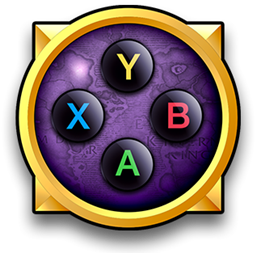
I'd love to get those XYAB buttons in-game btw 👍


How much i love this.
I would only suggest a less prominent magnifing effect when switching targets, like you did in the smart cursor.
Also im not good at healing mechanics, and id like to ask, is there a way you could set custom focus with the L1+arrows combo?
That way, before the encounter you could set a focus to the tank like l1+up and each time you need to instant target him you could do it.
You could also add up to four custom focus, oreven more if you add more modiffiers.
When you set a custom focus you could make appear this same circledisplaying life, color class avatar and the actual binding.
How does it sound?

Yes, the animations will be toned down a lot. I made them big to make sure everything was scaling correctly. Going to keep iterating on their behavior before releasing.
It does sound good to offer more bindings related to the cursor, but I'm thinking I could probably use the sticks and stick buttons to do this. Considering L1+up is probably a used binding by default, it would be unwise to remove even more bindings from the D-pad while the cursor is active.
No, it doesn't jump around without consent. What it does is:
New raid cursor focus? Okay, is this a friend or an enemy?
a. It's a friend. Make ALL healing spells heal the raid cursor instead of my target.
b. It's an enemy. Make ALL damage spells attack the raid cursor instead of my target.
If you were, for example, targeting the boss in a raid, you wouldn't need to change target to heal with the raid cursor. It just redirects all your healing spells to that unit instead.
Or let's say you have the boss focused, but your tank targeted. You can then go to the focus frame with your raid cursor and you will be able to heal your tank, but attack the boss with damaging spells.
You still have to keep moving the raid cursor around, since Blizzard doesn't allow you to auto-select target based on stuff like health, class, role, etc.

Btw, do you want to make a circular cast bar? Like a texture that rotates from 0% to 100%?
I can rotate and color it myself. I had this idea to put a small circular castbar that rotates around the portrait when you're casting on the raid cursor target.
Sounds good, can you give me a hint on size, or if there is an specific style to achieve? Inner or outter circle?
Wich limitations we have?
Do i have to draw a graphic for "empty" cast bar, and another to "full" castbar?
Something like these:
https://www.google.com/search?q=loading+icon&espv=2&biw=1745&bih=926&source=lnms&tbm=isch&sa=X&ved=0ahUKEwiYw7-695DKAhUGDSwKHQlSAxMQ_AUIBigB&gws_rd=cr&ei=xM2KVv3kBMSQsAGZ5oSAAQ
Should probably be 128x128.
Only one texture is enough as I will be rotating, fading and coloring it in-game.
something like:
While in raidcursor mode, l1+stick selects through targets, l2+stick: select through focused targets, and some other feature?
Regular stick, still movement
I have to say that i love the feeling of targeting with the d-pad. Gives a haptic feedback very clear.
Right now, I've changed it to be spell sensitive. If you watch that gif, you'll notice that I'm never actually changing target, but I'm casting heals on my party members. This is because I changed it to make your healing spells target the raid cursor target if the raid cursor target is friendly.
This change means it won't switch targets, which disables the haptic feedback, but I could always make that into a choice, whether you want to auto-target the raid cursor target, or maintain your current target but redirect appropriate spells to the raid cursor.
So if i for example spam renews, the raid cursor jumps between targets?
If so, how it chooses who needs the heal?
Or i am understanding all wrong¿
Ok, gonna try something.
First i will go for the basic model, and if you want then we can go for the fancy model. I wonder if there is a way to use animation, like a loop of an organic castbar. (and also if you would love to have it.
Would love to see a castbar with little bubbles inside, and a little explosion of green light on each succesful spell, but first we'll go for the basics.
Animations have to be done frame by frame and then placed in a grid side by side.
Here's an example of how that works. I think you'll recognize where it's from:

Here's another example of the "spell proc" animation:
Flash:

Spinning border:

I leave this here so you tell me your first thoughts.
I know it's pretty drafty, that's because i would like to do a good approach on what you see.

Second run, Ten slices to represent the accurate percentage of the cast, colors based on energy source.


Edit: added a full circle version.

CASTBAR SAMPLE OK 2.psd.zip

just a suggestion, how about adding a really fast fade-in. and a slow fade-out for each piece.
Slices will appear smoothly and once a cast is done, the 3 or four first slices wil be already faded, so you will clearly see the new cast.
wish it works.
question, could you add some flare or small effect at the front of the cast so it has more swag?
CASTBAR 3.psd.zip
Since we're doing rotations anyway I can add a spell effect and just send it spinning around the same axis 👍
This is what it looks like for now.

Maybe it would make more sense if it started and ended at the arrow instead of the top? 😕
Awesome approach!
I have only a very small suggestion that may work or not.
Actually the graphic grows centered with the protrait ring. Wich is cool.
Could you de-center the cast bar so at the beggining of the cast the graphic is a bit towards the right, and as the casting goes on, the cast bar centers with the portrait ring? (sometimes i hate myself for explaining like this.....)
It's until i try to do it that i realize how stupid my idea was.
So, forget my last two post... Those are not the posts you are looking for...
I love this approach, and im wondering if it would look more stilys with a thinner line.

It could come handy in the first bindings screen you have, as now there is plenty of room there, and it could give a quick look of the actual layout. But i would put the whole information like: "Square: LEFT SECONDARY ACCTION BUTTON 1: Smite [Icon]. Maybe just leaving the button and the spell attached to it, and maybe a message saying "not set" when there is no bind yet.
But as soon as you press a button to change its binding, i would switch to the actual config window, as it is very easy to manage.
The only thing i miss maybe on that screen is to be able to set a new binding either via Smart Cursor, or via Mouse.
And also, when i click on a specific combo to bind (Sas L1+O), it would come helpful to have a visual hint of the next interaction i'm expected to do.
A message for example:
"Click on an action bar button to set a new binding or choose from the list"
Want me to make a suggestion on how to display the bindings with this style and the behave you described¿
I cant download the artwork and ount it on facebook and then do the linelayout rite¿
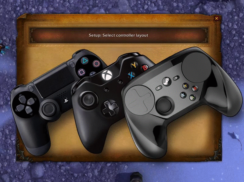
How you plan to display the back of the controllers¿ and also.... Are they really needed?
I mean, those back buttons can be represented with line that comes from behind
You're right. But added them nonetheless. This is where I'm at right now:

Drop shadow:

I was thinking it would display the base binding and then change when a modifier is held.
I'm adding graphics for the back of the controllers so that the interface makes more sense, but I wanted to ask your advice for doing the lines like in the image I posted. Here's new graphics:


I pushed the "Config layout.psd" fiile to the git if you want to check it out. It's pretty poorly made at the moment, but I've drawn the basics. Keep in mind that wow's graphics engine doesn't sit well with extremely thin diagonal lines, so they probably have to be a bit thicker than what I've used in the psd.


How much i love the monk colouring.
Gonna try to make them tommorrow morning, ok?
Do you want to make LG and RG button graphics or should I do it myself? As you can see, something is missing in this screenshot. 😉

Sure. Whenever you have time. I already made the 64x64 pieces, but they might not look completely right, as I didn't use shapes to make them:

What is mostly needed right now are the 32x32 icons for action bars.
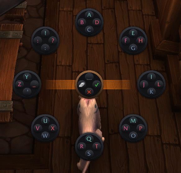
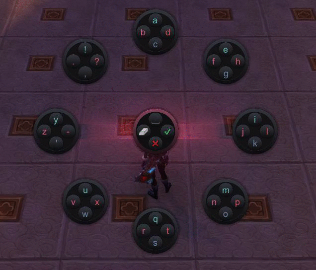
Got tired of coding so decided to update the binding wizard with the new style. 😉


I think its visually bad centered, maybe it would make a better feeling if the whole group of controllers is moved slightly to the left.
The steam controller gray doesnt match with the other controllers, if i can grab the original image i can do the colour correction. If you want to try, you only have to select the layer of the controller and add a correction layer: Selective correction (at the bottom of the layers pannel). Fron there you have to change the values under grays and blacks by selecting the in the dropdown menu at the top of the new panel
The original image is in the artwork folder if you want to mess around with it:
Artwork/Controller Splash.psd
https://github.com/seblindfors/ConsolePort/blob/master/Artwork/Controller%20Splash.psd
I agree that it's off center. Will fix :)

I came up with this idea.
The idea is a simple spinning cicle synced to a loop per second.
Based on what we spoke, i tried to reflect the next:
- You are casting (the spining thing)
- What you are casting (persistent icon)
- To who (class colour)
- Visible Flash when done
I avoided to represent the casting status.
I'd like to rethink if it's really needed to see the cast status knowing that:
1- There is a huge castbar somewhere on the screen.
2- Normally you know your shit, so you plus or little know how much time consumes each spell.
3- For fake casting, i also think that you end up doing it incstentively.
4- If you casted a wrong spell, you will cut it as soon as you notice.
With this in mind and with the limitations appeared for the spining cast, i thought that it may be interesting to represent that you are casting, rather than how much time of cast is left.
Oh, and i tried to make a loop for each second, so there you can have a slight guide of the cast status, maybe...
forgot to mentino that the only keyframed animatino would be half the spin wich is a 15 frames. how it sounds to you?
edit:well, actually it could be done without keyframe animation maybe
How big it is the cursor now?
Enviado desde mi iPad
El 19/1/2016, a las 2:35, Sebastian Lindfors [email protected] escribió:
If there are no graphical changes, then you only need one frame that can be rotated in game.
I like what you have in mind here, but how would this look on the actual cursor, since it's not nearly as big as that mockup?—
Reply to this email directly or view it on GitHub.
If there are no graphical changes, then you only need one frame that can be rotated in game.
I like what you have in mind here, but how would this look on the actual cursor, since it's not nearly as big as that mockup?
CASTBAR 04.psd.zip
Here i leave the PSD in case you want to try something.
I would like to mention the arrow of the raid cursor.
When you are not casting, the arrow is too far away. Once you cast it makes sense, but not while in lazy mode.
Maybe you can move it when casting. dunno
The arrow is far away to let you see the unit frame behind the portrait properly. Some unit frames display debuffs and other information that might be central to your next action as a healer, which is why the portrait shouldn't completely cover the unit frame, whereas the arrow is small and unintrusive.
Btw want ne to srill dig on the idea of the cast in a small circle at the bottom part of the avatar?
As you said, the first mockup was in ultra hd, and when dealing with the real thing it turned out the initial desigb was too small.
I think i could tweak it a bit to achieve a still small casting circle but more visible.
That in case you dont like the hybrid version i just uploaded


I added the new casting texture in the latest patch but haven't changed the animations yet.
^^
I rushed to check it out.
Enviado desde mi iPad
El 20/1/2016, a las 20:34, Sebastian Lindfors [email protected] escribió:
I added the new casting texture in the latest patch but haven't changed the animations yet.
—
Reply to this email directly or view it on GitHub.


Teaser for next project:
http://imgur.com/a/715QS
Like it.
Question, is there a chance you could add more light sources?
In wich case i would suggest to check some videos about portait lighting in
photography. Kind of easy light setups for great results :)
El 23/1/2016 22:59, "Sebastian Lindfors" [email protected]
escribió:
[image: image]
https://cloud.githubusercontent.com/assets/7464938/12533067/d3ea4dc6-c224-11e5-86f2-058aaed24ec3.pngTeaser for next project:
http://imgur.com/a/715QS—
Reply to this email directly or view it on GitHub
#5 (comment)
.
Only one omni light and one directional and they are a pain in the ass to play with 😉
The screenshot on GitHub is much darker than how it looks in-game. The imgur link has better quality.

Updated:
http://imgur.com/a/Wh8Mt
Those images have more ambient light and a shadow?
(Not sure about the ambient light)
The directional light is more widely spread and the omni (ambient) light is both whiter and lighter.
This is another mockup with a blend of the class colors and some Blizzard art:
http://imgur.com/a/4xGJl
I love this
El 3/2/2016 23:14, "Sebastian Lindfors" [email protected] escribió:
The directional light is more widely spread and the omni (ambient) light
is both whiter and lighter.
This is another mockup with a blend of the class colors and some Blizzard
art:
http://imgur.com/a/4xGJl—
Reply to this email directly or view it on GitHub
#5 (comment)
.


RELEASE CANDIDATE??!!!
Wow! i got a bit emotional after reading those two letters!
Tomorrow i will have some time to spend on trying the new stuff on wow aswell as your last version of the addon.
I'd like to remind you that i my look i'm not there, but i am. So you can ask me to help with any graphic aspect you need.
I'd love to help you to push this even further if i can.
Congratulations on RC!!