Layout not optimal , how about some linebreaks?
yoshimo opened this issue · 0 comments

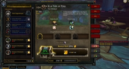
As you can see here, we have long mission titles , big font size and there is overlap everywhere (ignore the compasshud at the top)

Having new lines for time left and cost makes this easier to read and looks better.
Maybe we could shrink the icons at the beginning and the end of each row a bit more and place the text above?