v1.0.0 tooltip goes off screen
hollo6 opened this issue · 7 comments

In version 1.0.0, half of the dropdown menu goes off the screen.
This was not a problem in any previous versions.
v0.21.1:

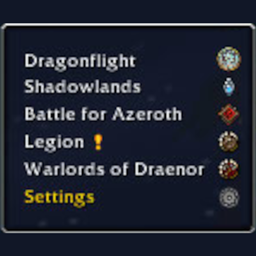
v1.0.0:


Thank you for reporting this!
Although I marked this as a bug, it's not. I simply didn't imagine that someone would have the minimap button so far on the left side of the screen.
While Blizzard's tooltip is clamped by default to the screen I have to clamp this custom tooltip myself manually.
I'll try to release an updated version as soon as possible.
PS. Also thank you for the screenshots. They are very helpful!
Thank you!
I think it might make more sense and potentially be easier to implement adding an option for us to choose an anchor point for the tooltip and/or font size / scale.
Looking at my screenshots again it would all be solved by removing those unnecessary spaces between the expansion names and their icons. This would make the tooltip inherently narrower than the minimap again (just like it was in previous versions), so its placing wouldn't have anything to do with the tooltip in the first place.
I think it might make more sense and potentially be easier to implement adding an option for us to choose an anchor point for the tooltip and/or font size / scale.
This is what I plan to do and what is partially already in work, but I knew I couldn't finish it before Easter so I didn't include it in the major release. The anchoring part wasn't planned since I wrongly assumed the minimap button would stay on its standard screen position. But after seeing your screenshots I'll definitely include that.
Looking at my screenshots again it would all be solved by removing those unnecessary spaces between the expansion names and their icons. This would make the tooltip inherently narrower than the minimap again (just like it was in previous versions), so its placing wouldn't have anything to do with the tooltip in the first place.
True. I'll look into that as well. I haven't checked, yet, eg. if hiding the expansion icons also hides that row. That would help a little.
I'll see what I can do.
Thanks!
Just remove that big gap you added in this version and all will be well :)
In addition, I just noticed that the strata is not right either:

Before:

Hi, I just released a patched version addressing almost all of the above mentioned issues.
The changes are described in the latest changes of today.
- Additionally to the changes and fixes mentioned there I also added the slash command "anchor" (
/mrbp anchor). This toggles the drop-down menu anchor between left and right. This is just a temporary solution until I finished the settings for styling and scaling. - Also not mentioned is that I've removed the extra spaces. Those appeared automatically after making the menu wider. Changing the width will also appear as an option in a future release.
Have fun!