LibRedDropdown is another library that allows devs to add some standard GUI elements into their addons. Initially this lib was created to replace Blizzard's UIDropDownMenu; now it contains 6 controls.
Getting lib instance:
local libRedDropdown = LibStub("LibRedDropdown-1.0");All element constructors are static, you should call it like lib.CreateControl() (using dot). All element methods are instance methods, you should call it like element:SomeMethod() (using colon).
Basically, you should call :SetParent and :SetPoint methods for all elements after creating.

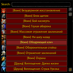
Replacement for Blizzard's UIDropDownMenu.
local dropdownMenu = libRedDropdown.CreateDropdownMenu();| Method | Description |
|---|---|
| dropdownMenu:SetList(table entities, boolean dontUpdateInternalList) | Sets list of entities. Details |
| dropdownMenu:GetButtonByText(string text) | Returns button with specified text on it (or nil if no button found). |
Checkbox with clickable label. It's inherited from Blizzard's CheckButton so you can use all its methods
local checkbox = libRedDropdown.CreateCheckBox();| Method | Description |
|---|---|
| checkbox:SetText(string text) | Sets text of label. |
| checkbox:GetText() | Gets text of label. |
| checkbox:GetTextObject() | Returns text object of label (FontString). |
| checkbox:SetOnClickHandler(function func) | Sets OnClick handler. Details |

Checkbox with three states: disabled, enabled#1 and enabled#2
local triStateCheckbox = libRedDropdown.CreateCheckBoxTristate();| Method | Description |
|---|---|
| triStateCheckbox:SetTextEntries(table entries) | Sets text values for each state. Example |
| triStateCheckbox:SetTriState(number state) | Sets state of checkbox. Example |
| triStateCheckbox:GetTriState() | Returns the state of checkbox (number). Example |
| triStateCheckbox:SetOnClickHandler(function func) | Sets OnClick handler. Example |

Small color frame with text label
local colorPicker = libRedDropdown.CreateColorPicker();| Method | Description |
|---|---|
| colorPicker:GetTextObject() | Returns text object of label (FontString). Example |
| colorPicker:SetText(string text) | Sets text of label. Example |
| colorPicker:GetText() | Returns text of label (string). Example |
| colorPicker:SetColor(number red, number green, number blue, number alpha) | Sets color. Color values are between 0.0 and 1.0. If alpha is nil, it will be interpreted as 1.0 Example |
| colorPicker:GetColor() | Returns color (number red, number green, number blue). Example |
| colorPicker.func | You should assign function(self, r, g, b, a) to this variable. This function will be executed when any value (red, green, blue, or alpha) is changed Example |

Just a button. But with optional independent checkbox inside it. Has sharper edges than Blizzard's one!
local button = libRedDropdown.CreateButton();| Method | Description |
|---|---|
| button:GetTextObject() | Returns text object of label (FontString). |
| button:SetText(string text) | Sets text of label. Example |
| button:GetText() | Returns text of label (string). Example |
| button:SetGray(boolean gray) | "Disables" button. It's not actually disabled, it's just grayed out. |
| button:IsGrayed() | Returns "disabled" state (boolean). |
| button:SetChecked(boolean checked) | Check/unchecks internal checkbox. |
| button:GetChecked() | Returns true if internal checkbox is checked (boolean). |
| button:SetCheckBoxVisible(boolean enabled) | Enables/disables internal checkbox |
| button:GetCheckBoxVisible() | Returns true if internal checkbox is enabled (boolean). |
| button:SetCheckBoxOnClickHandler(function func) | Sets handler for checkbox-checked event. See this example |

Slider with textbox. Example
local slider = libRedDropdown.CreateSlider();| Method | Description |
|---|---|
| slider:GetTextObject() | Returns text object of label (FontString). |
| slider:GetBaseSliderObject() | Returns slider object (Slider). |
| slider:GetEditboxObject() | Returns editbox object (EditBox). |
| slider:GetLowTextObject() | Returns text object of label of minimum value (FontString). |
| slider:GetHighTextObject() | Returns text object of label of maximum value (FontString). |
Very simple text tooltip. Example
local tooltip = libRedDropdown.CreateTooltip();| Method | Description |
|---|---|
| tooltip:SetText(string text, number textureID) | Sets text (and optionally icon) of tooltip. |
| tooltip:GetTextObject() | Returns text object of label (FontString). |
| tooltip:SetSpellById(number spellid) | Sets spell as info for tooltip. |
table entites: it is a table with information about buttons that DropdownMenu should display. Valid fields of each entity:
- .text: button's text (string)
- .font: button's text font (string)
- .icon: button's icon (number)
- .func: function that will be executed on user click (function)
- .onEnter: function that will be executed on mouse enter (function)
- .onLeave: function that will be executed on mouse leave (function)
- .disabled: set to true to disable button - will be grayed out (boolean)
- .dontCloseOnClick: set to true to prevent DropdownMenu from hiding when user clicks on button in list (boolean)
- .checkBoxEnabled: set to true to enable button's internal checkbox (boolean)
- .onCheckBoxClick: handler for checkbox-checked event (function)
- .checkBoxState: state (checked/unchecked) of button's internal checkbox (boolean)
- .onCloseButtonClick: if not nil, then there will be a small "X" buttons at the right of buttons in the list. This callback will be called on press on this button (function)
- .buttonColor: if not nil, then button will have this color. Format: { red (0.0 - 1.0), green (0.0 - 1.0), blue (0.0 - 1.0), alpha (0.0 - 1.0) }
boolean dontUpdateInternalList: prevents this method from changing internal list of buttons. Used internally by searchbox.
local t = { };
for i = 1, 100 do
  local spellName, spellIcon = GetSpellInfo(i);
  table.insert(t, {
    icon = spellIcon,
    text = spellName,
    onEnter = function(self)
      GameTooltip:SetOwner(self, "ANCHOR_RIGHT");
      GameTooltip:SetSpellByID(i);
      GameTooltip:Show();
    end,
    onLeave = function() GameTooltip:Hide(); end,
    func = function() print(i, spellName); end,
    checkBoxEnabled = true,
    onCheckBoxClick = function(checkbox)
      if (checkbox:GetChecked()) then
        print("Checked!");
      end
    end,
    checkBoxState = false,
	buttonColor = {1, 1, 0, 1},
  });
end
dropdownMenu:SetList(t);function func: function to execute on click
checkbox:SetOnClickHandler(function() print("Clicked!"); end);local triStateCheckbox = libRedDropdown.CreateCheckBoxTristate();
triStateCheckbox:SetTextEntries({
"Disabled",
"Enabled#1",
"Enabled#2",
});
triStateCheckbox:SetOnClickHandler(function(self)
if (self:GetTriState() == 0) then
print("Disabled");
elseif (self:GetTriState() == 1) then
print("Enabled#1");
else
print("Enabled#2");
end
end);
triStateCheckbox:SetTriState(1); -- Set to "Enabled#1"local colorPicker = libRedDropdown.CreateColorPicker();
colorPicker:SetParent(UIParent);
colorPicker:SetPoint("CENTER", 0, 0);
colorPicker:SetText("Label");
colorPicker:SetColor(1, 1, 0, 1);
colorPicker.func = function(self, r, g, b, a)
-- some code that handles new value of r, g, b, a
end
colorPicker:Show();local button = libRedDropdown.CreateButton();
button:SetParent(UIParent);
button:SetText("Click me!");
button:SetWidth(110);
button:SetHeight(20);
button:SetPoint("CENTER", 0, 0);
button:SetScript("OnClick", function(self, ...)
print(string.format("Button with label '%s' is clicked!", self:GetText()));
end);local minValue, maxValue = 0.3, 3;
local slider = libRedDropdown.CreateSlider();
slider:SetParent(UIParent);
slider:SetWidth(200);
slider:SetPoint("CENTER", 0, 0);
slider:GetTextObject():SetText("Label");
slider:GetBaseSliderObject():SetValueStep(0.1);
slider:GetBaseSliderObject():SetMinMaxValues(minValue, maxValue);
slider:GetBaseSliderObject():SetValue(1.5);
slider:GetBaseSliderObject():SetScript("OnValueChanged", function(self, value)
local actualValue = tonumber(string_format("%.1f", value));
slider:GetEditboxObject():SetText(tostring(actualValue));
end);
slider:GetEditboxObject():SetText("1.5");
slider:GetEditboxObject():SetScript("OnEnterPressed", function(self, value)
if (slider:GetEditboxObject():GetText() ~= "") then
local v = tonumber(slider:GetEditboxObject():GetText());
if (v == nil) then
-- Value must be a number
slider:GetEditboxObject():SetText(tostring(1.5));
else
if (v > maxValue) then
v = maxValue;
end
if (v < minValue) then
v = minValue;
end
slider:GetBaseSliderObject():SetValue(v);
end
slider:GetEditboxObject():ClearFocus();
end
end);
slider.lowtext:SetText(tostring(minValue));
slider.hightext:SetText(tostring(maxValue));-- self-initialized
local button = libRedDropdown.CreateButton();
button:SetParent(UIParent);
button:SetText("Click me!");
button:SetWidth(110);
button:SetHeight(20);
button:SetPoint("CENTER", 0, 0);
button:SetScript("OnClick", function(self, ...)
  print(string.format("Button with label '%s' is clicked!", self:GetText()));
end);
libRedDropdown.SetTooltip(button, "I'm tooltip!", "LEFT"); -- the last argument is justification of text
-- manual
local button = libRedDropdown.CreateButton();
button:SetParent(UIParent);
button:SetText("Click me!");
button:SetWidth(110);
button:SetHeight(20);
button:SetPoint("CENTER", 0, 0);
button:SetScript("OnClick", function(self, ...)
print(string.format("Button with label '%s' is clicked!", self:GetText()));
end);
local tooltip = libRedDropdown.CreateTooltip();
button:HookScript("OnEnter", function(self, ...)
tooltip:ClearAllPoints();
tooltip:SetPoint("BOTTOM", button, "TOP", 0, 0);
tooltip:SetText("I'm tooltip!");
tooltip:Show();
end);
button:HookScript("OnLeave", function(self, ...)
tooltip:Hide();
end);