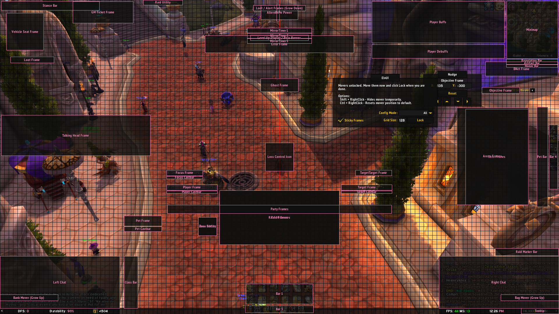
Keep the important things in the center, free up screen space, maintain a clean aesthetic, use weakauras to fill the gaps.
Note: This is absolutely barebones, I do not like being flooded with information so a lot of buffs/debuffs aren't shown by default. If there is a buff or debuff I would like to be aware of I create a separate weakaura to track it. You can replace Elv's raid frames with your choice. This is about minimalism.
Main fonts used are Expressway and Homespun.
