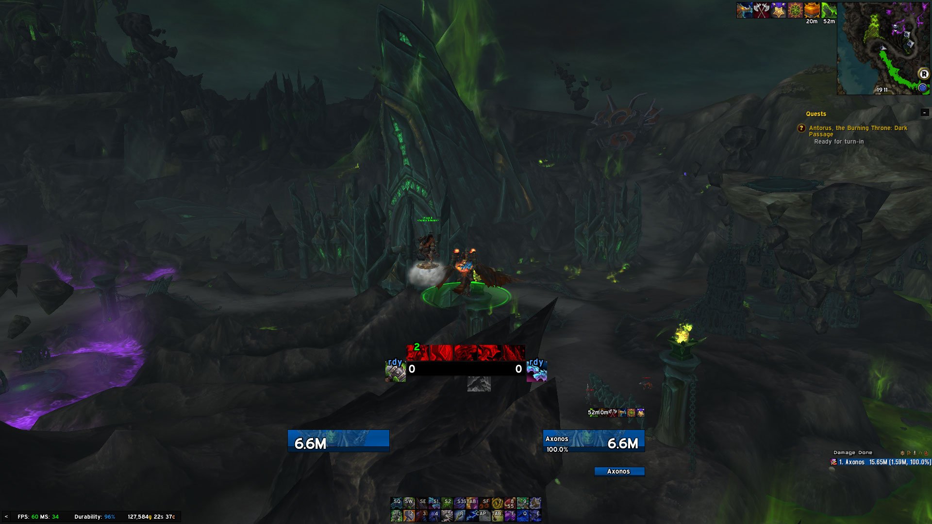
Clean UI for DPS by Axonis
I'm personally playing DPS and Tank specs with this setup.
Lot of hidden bars such as 2 full action bars on the bottom left, next to chat, hidden artifact progress, honor, info bar.
There is quite a bit of place free to be used by Weakauras, BigWigs/DBM, Details and others.
As you can see on the picture, I'm using Details on the bottom right, along with WA in the middle.
To show Action bars on the bottom navigate through - /ec - ActionBars - Bar1/Bar2 - Mouse Over
Feel free to tell me your ideas or wishes for future improvements here in comments or directly on discord: Axonis#6491
If you are interested in Enhancement weakauras visible in the middle of the screenshot - Axonis' complete Enhancement 7.3.5 WAs.
If you are interested in any other addition you can see in the picture, just feel free to contact me.
Changelog:
v2 - Overhaul, new positions for cast bars, different text on player and target bar
v1 - Initial commit
