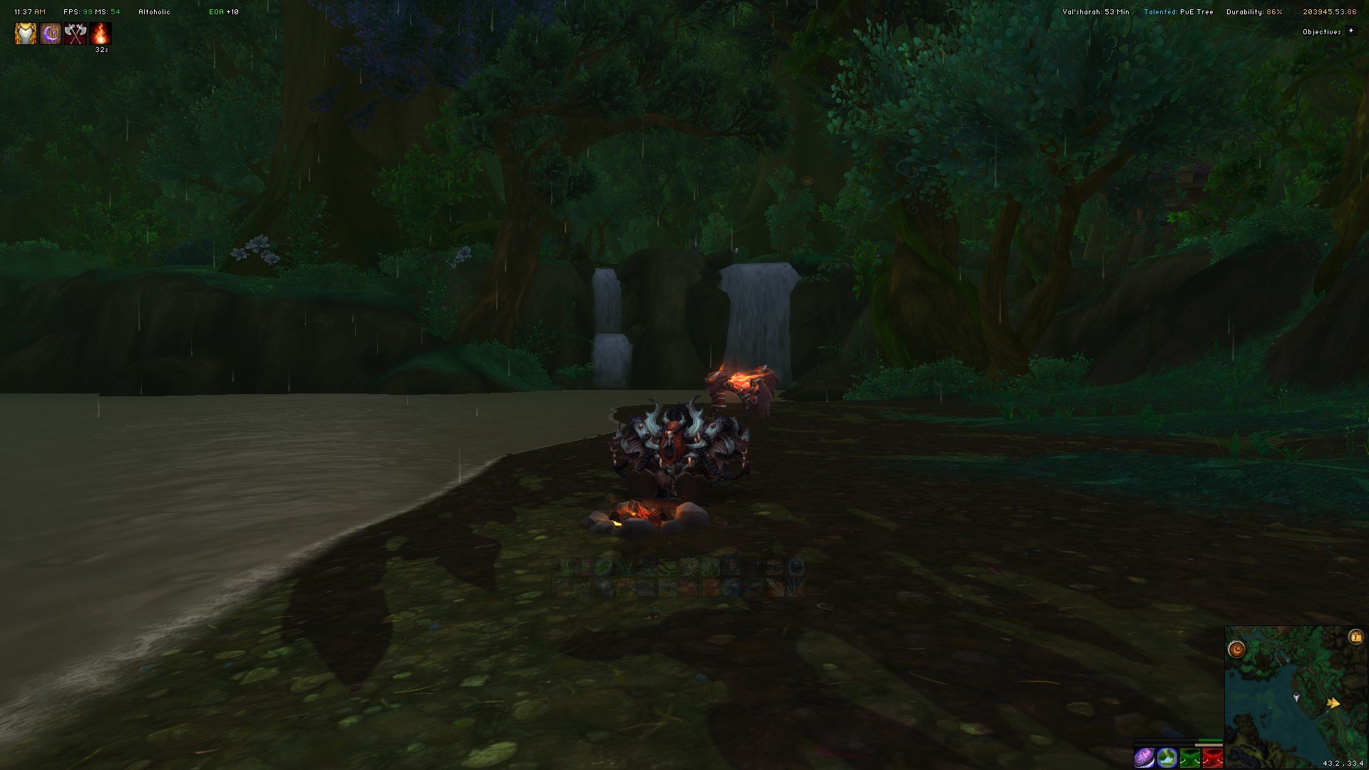
My basic Resto Druid ElvUI profile dump. (https://www.twitch.tv/exceptstreams)
I'm constantly working on the UI and am going to be updating this page as often as I can as well.
If you have any questions or need help please feel free to drop by my Twitch or Discord at any time
Included ElvUI Modifications:
- ElvUI
- AddOnSkins
- Clean Boss Button
- ElvUI Shadow & Light
Version:
(23/09/2017) 1.2a Changelog:
- Minimap no longer hides on entering combat, as per popular demand. It was kinda bad, I know.
- Setup NamePlate filters to make Fel Explosives green and large so this mythic+ week is even easier.
- Fixed some minor filter issues with party frames.
- Some either minor fixes.
(07/09/2017) 1.2 Changelog:
- Enabled Smooth Bar transitions
- Enabled Combat Fade on Player and Target Frames and a 90% one on the 2 main Action Bars.
- Enabled Raid-wide Sorting
- Cleaned up Boss Frames. They are on the left and use Expressway now.
- Cleaned up Raid Frames. No more Power Bars. Decreased spacing.
- Disabled the pesky offline indicator through Shadow and Light
- Disabled Threat indicators everywhere I could find them.
- Slimmed down the Power Bar on Player and Target frames to 4px
(19/05/2017) 1.1 Changelog:
- Changed the Unit Frames to solid colour with lighter background for clearer visibility.
- Changed secondary font to Expressaway.
- Changed Power bars colour to represent class unit's class.
- Changed the primary as well as secondary bar textures to ElvUI Blank.
- Got rid of the info panel under the chat.
- Got rid of the Data Texts under the minimap.
- Added Data Texts to the top of the screen.
- Moved the buffs/auras to the top left.
- Moved Raid/Party Frames to be under the Action Bars.
- Resized minimap to 225.
- Resized most of the buttons to 28.
- Resized Player and Target Unit Frames to 41 height 220 width.
- The 3rd Action Bar is now mouse-over only on the bottom of the screen where all the action bars used to be.
(19/04/2017) 1.0
The first stable variation of the UI.
Textures and Fonts
Textures
I use ElvUI Blank as the texture for all the power bars, timer bars and nameplates. If you want something more vibrant and eye-catching rather than flat, a good replacement is PolishedWood or ElvUI Norm. Both compliments the other transparent textures of the UI very nicely.
Wherever I can't use ElvUI Blank I use Minimalist instead but it turns out much nicer if you keep all the accents the same.
Fonts
The dominating font used in the UI is HaxrCrop (http://www.fonts2u.com/haxrcorp-4089-cyrillic-altgr-regular.font). I absolutely love it but there's a little problem. Since it's a bitmap font, anything beyond 17p in size looks abysmal. In order for it to look good at 17p please use "monochrome outline" wherever it is available. If it's not, play around with the sizes and the outline types but it should always look decent with just an "outline" at 16p.
I'm pretty sure that after the import the font is going to be broken and if you want to keep using the font from the screenshot here's what you need to do:
1. Download the font (http://www.fonts2u.com/haxrcorp-4089-cyrillic-altgr-regular.font). The reason we are using this link is because ElvUI will only eat .ttf while all the other variations of this font are .fon
2. Copy it into "World of Warcraft\Interface\AddOns\ElvUI\media\fonts\"
3. Rename the font into "HaxrCorp12cyr" while leaving the extension the same
4. Open "World of Warcraft\Interface\AddOns\ElvUI\media\sharedmedia.lua" with a text editor
5. Add exactly this line at the end of the file: LSM:Register("font","HaxrCorp12cyr", [[Interface\AddOns\ElvUI\media\fonts\HaxrCorp12cyr.ttf]])
6. Save it and restart the game.
Breakdown
1. Map Area (Bottom-right corner)
The bottom-right area is a place mostly for all the out of combat things you could need. There are 3 hotbars, one of which only has 4 slots, and the other two while having the full 12 only visible on mouseover to not clutter the screen. There are 3 databars, including the visible Artifact and Reputation bars and the hover-over Honor bar which is just a little extra that you can disable if it's irrelevant. On top of the map there's the traditional menu in case you need anything.
2. Objectives Area (Top-right corner)
Togglable Quest List and the traditional Aura bar. It used to be in the middle but ended up just cluttering the screen so I moved to the top. Suit yourself.
3. Meters (Top-left corner)
A togglable ElvUI chat window with two embedded Details windows. I choose to show and hide it with a hotkey although you can absolutely set it to hide and show in/outside of combat.
4. Chat Area (Bottom-left corner)
A bunch of info and the chat with no backdrop to make more room on the screen.
